Everyone landed here. No one owned it.
16% of users abandoned on their second visit. Onboarding had its own purpose-built flow; it handed people to a dashboard that had gone a long time without being touched, where they arrived with a file in hand and were offered a blank canvas. Reframing the problem from usability to entry architecture lifted activated users by 11%.
Director of Product Design & Research. Found the problem in the behavioural data, made the case to product until it was prioritised, reframed the brief around the user's job, set the design direction and owned the outcome metrics.
Second-time UX. 16% of users abandoned on their second visit, so the surface to fix was the one people met on the way back — not the onboarding everyone was already watching.
The surface every Prezi user is handed to after onboarding, on a platform serving 160M+ users.
+11% activated users. Total presentation creation +3%.
The surface at the end of everyone else's flow.
Onboarding was owned. What came after it wasn't.
First-time users didn't start on the dashboard. They went through a purpose-built onboarding flow — designed, maintained, watched. The dashboard was where that flow let go of them: at the end of onboarding, or when they came back the next time.
And that is exactly where we were losing people. 16% of users abandoned on their second visit — not during onboarding, which everyone was watching, but immediately after it, on the surface nobody was. That number is what set the scope: the experience to fix was the second-time one.
of users abandoned on their second visit — the first time most of them met the dashboard.
The dashboard had gone a long time without being touched. It offered three ways to create, sorted by what the product could output: a presentation, an infographic, a video. Below that, the projects you had already made. It was organised in the product's own language, not the user's — and nobody had revisited that assumption since it was made. When AI generation shipped, it arrived as a banner promoted above those same tiles — but using it still meant picking a template first; the template flow just now had AI working underneath it. It added a capability. It did not change how people found their way in. The usual reading of a drop at that point is a usability problem.
It wasn't. The behavioural data said something more specific: people arrived with existing material — a PowerPoint, a PDF, a document they had already written. They were not looking for a template or a blank canvas. They were looking for somewhere to put a file.
A different problem than the one we were given.
Nobody wakes up needing an infographic.
That finding changed the brief. The question stopped being how do we make this dashboard easier to use and became how do we redesign the entry architecture around the job people arrive with.
This is a jobs-to-be-done reframe, and the before state shows exactly why it was needed. The dashboard was sorted by the artefacts Prezi could produce — presentation, infographic, video. But nobody arrives wanting an artefact type. They arrive with a job: I present this to the board on Thursday and I already wrote the document. Sorting the entry point by output type asks people to translate their job into the product's categories before the product will help them. Sorting it by how they arrive removes that translation.
It is a bigger claim to make than a usability fix, and it needed the research to hold it up. Reframing a usability request into an architecture change is only credible when you can point at the behaviour that justifies it and commit in advance to the metric that will judge it.
The important decision was not visual styling. It was changing which jobs the dashboard made immediately available.
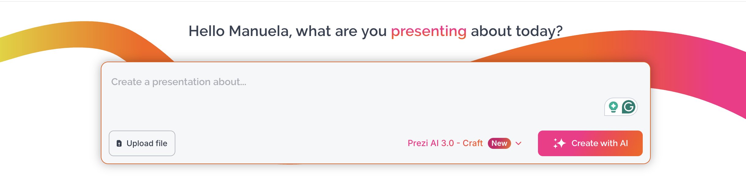

Three decisions, one willing trade.
Promoting something means demoting something else.
- Make file import visible. The existing-content path stopped being something you had to know about and became something the dashboard offered.
- Introduce a stronger AI entry point. A clear, prominent way in, rather than a capability discoverable only inside the editor.
- Reduce emphasis on templates. For someone who arrived with a file or a clear brief, a template meant redoing work they had already done. Keeping it in front was costing us those users.
What the two promoted routes have in common matters more than either on its own: they ended up in the same input. Type what you need, or drop the file you already have — one field, one question, asked in the user's language rather than the product's. Creating by output type moved to the sidebar, where it still serves the people who want it.
The third decision is the trade. We knew template use would fall, and we accepted it — because the metric we were judged on was activation, not template engagement. Naming that in advance is what made the result readable afterwards instead of arguable.
What actually changed.
Activated users. The business-relevant result, and the metric the work was judged on.
Total presentation creation across the platform.
Leading behaviours explain it. Activation is the result.
The mechanism metrics are the evidence that the theory was right: people could now act on the job they arrived with, so they did — dramatically. File starts and uploads moved most because that path went from hidden to primary. The AI entry point moved because it went from implied to explicit.
But those are leading indicators, not the answer. Activated users rose 11% and total presentation creation 3% — that is what the business cares about, and that is the number I put my name against.
Seeing it was not the hard part.
The data was clear early. The roadmap was not.
I raised this as soon as I saw it in the data. Getting it built took considerably longer: the dashboard belonged to no one, so it wasn't naturally on any PM's roadmap — nobody wanted to add the work to theirs. I had to keep making the case before it found a home.
That is the honest shape of most work at this level. It was never about convincing one reluctant PM. The dashboard wasn't failing loudly, and "the surface everyone lands on is solving the wrong job" is a harder thing to get onto a roadmap than a feature someone has already asked for, because it starts with no one whose job it clearly is. The design work here was real, but it was not the part that took the most persistence.
Narrowing to the second-time experience is what made it winnable. A proposal to rethink the whole arc from first session to habit would have been the more ambitious pitch and would still be waiting. The drop sat on the second visit, so that is where the argument sat — one surface, one metric, one release.
The transferable part: a roadmap is never short of urgent things. This wasn't one of them — the dashboard wasn't breaking, so it had no natural claim on anyone's attention. Getting it prioritised meant making the case with evidence solid enough to compete against everything urgent already in the queue. Important only earns its place next to urgent when it's backed by something harder to argue with than a hunch.